 Asymmetrical Balance - I think that this magazine cover is balanced, because the man is leaning to the right and the text on the left is bigger to balance out. The text on the right is smaller just to make it balanced.
Asymmetrical Colour - This is asymmetrical by color because there is a bright, stand out, red line that is canceled out by the large area of dull, blue.


 Asymmetrical texture - this magazine is by texture, because the girl has a dark shirt, which is strong, however the background is a bit blurry.
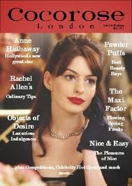

AMBER
This is a good start and you have the basics here. However, this does not have a huge amount of detail and you will need to explain your answer more.
No comments:
Post a Comment