Question 1 Mock GCSE:
What two conventions have i used and why?
I have used a celebrity on the front of my magazine cover. I used a celebrity on the magazine so that it will attract readers. I chose Justin Bieber because he is well known and has millions of girls with his picture on their wall.
I have also used cover lines, these are for selling purposes. If someone reads some text they like then they are more likely to buy the magazine.
Question 2
What are the effects of my layout, typography, colour choice and language choice?
On my magazine cover i have used an effect, in which the larger, more important information is on the left and the smaller, less important information is on the right. The larger information stands out and makes the reader notice it and furthermore read on. This is called asymmetrical balance. My font is serif and therefore easier to read. Also, within my magazine i have included exlamatives and lists within my sub-headings.
Question 3
What issues of representation have i presented?
The issues of my magazine are : image qualitys aren't the best, more effective colours could of probably been used and the magazine itself was very plain and basic.
Tuesday 11 March 2014
Wednesday 12 February 2014
Colour Connotations
This magazine uses the colours pink, yellow, grey and white. These colours show different things about this magazine. Yellow - The colour yellow is bright and a very stand out colour, this colour is used to draw the readers eye. It also is a colour of fun and the text in yellow says that. Pink - Pink is a very feminine colour so this indicates that this magazine is primarily for girls. White - The white text is used not really to stand out, but just a filler colour where they want the writing to be seen but not initially. Grey - The background is grey, which is a dull colour to make any more important peices of information stand out.
This magazine uses colours red, yellow, white and many shades of blue. Red - As well as blue this colour is very masculine to draw the attention of men. The red is also used to show stamina and physical energy. Blue - Blue is used in many different shades the light blue is a soothing, calm blue. But the darker blue gives a thick, bold look which makes the viewer see it initially, before anything else. Again in this magazine the background is a poring, plain colour (white), this is over used in magazines to make the more important ideas stand out. Yellow - Yellow is used here to highlight very few bits of text, this colour is used because it is bright and stands out.

This magazine contains colours white, grey and a golden yellow. The gold is used because this magazine is trying to show that London is a posh place and gold, like the other colours used, it's classed as a rich colour. The grey used is not a boring, dull grey, but a metallic grey. This goes with the gold because silver and gold are two colours that when used correctly give off a fancy effect.
GREEN
Really good piece of work with the right amount of detail and analysis. Well Done.
Tuesday 4 February 2014
Planning my lifestyle magazine
Planning my lifestyle magazine
Titles
Titles
- Glamour girls
- Beauty and the beast
- Glitz and glamour
- Life in London
- Girly magazine
- Beauty magz
- Glamourism
- Girls, girls and more girls!
- Style
- GFH (gossip for her)
Cover lines
- Bad boy Beiber
- What should you be wearing?
- Keeping a healthy diet
- What one direction get up to
- New phone - text with your friends ALL day.
- Are Nokia becoming less block-like.
- Cuttest clothes
- True life teens
- Planning your best future
- Ready, set, shop!
Tuesday 28 January 2014
Balance in Design
 Asymmetrical Balance - I think that this magazine cover is balanced, because the man is leaning to the right and the text on the left is bigger to balance out. The text on the right is smaller just to make it balanced.
Asymmetrical Colour - This is asymmetrical by color because there is a bright, stand out, red line that is canceled out by the large area of dull, blue.


 Asymmetrical texture - this magazine is by texture, because the girl has a dark shirt, which is strong, however the background is a bit blurry.
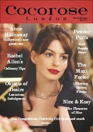

AMBER
This is a good start and you have the basics here. However, this does not have a huge amount of detail and you will need to explain your answer more.
Monday 20 January 2014
Font sheet Homework
Futuristic - This font is very funky, and is unusual, this gives it a futuristic look, because older fonts tend to be bold, boring fonts. The i's have circle above them which makes it stand out even more. The colour of the font (orange) makes it easily noticeable because of how the colour orange isn't seen very much.
Sturdy - This font is very thick, bold, chunky etc. It is more of a older font because of these features. This colour used is very bland but the boldness makes this recognisable.
Elegant - This font is rich and elegant. You would see a font like this used in fancy letters and invitations. The colour is a rich pale blue.
Birthday - This font is stretched a lot. I like this font because it's unique as the letters have been chipped away at which makes it look cooler. The orange again is rarely used.
Sympathy - This font is a common font used on some medieval like things, such as games etc. The lines underneath the 'u' like shapes are meant to make the 'u' into a y. The colour used is plain blackish, greyish.
Father's Day - This font is stretched out as well as birthday and looks clear, but old. The colour red makes it look bright and easily stand out.
Favourite font
My favourite font is Serious, the colour used makes it almost metallic and like the side of a car. It is bold and big which makes it noticeable and it just looks awesome.
GREEN
Really good piece of work with the right amount of detail and analysis. Well Done.
Tuesday 7 January 2014
Lifestyle Magazines
The person on the front is showing off his muscles indicating if you were to read the magazine you will one day look like him. The colours are bright, attractive and appealing to bring the audience towards it. The layout of he page has important articles towards the top of the page in bigger fonts, however he less important information is at the bottom of the page, this effects the reader by making them want to read the larger fonts first.
The language used is directed a the reader in order o bring them into magazines, examples of such are, 'Strip away belly fat'.
This front cover is a lifestyle of a Celebrity (Simon Cowell), on the magazine cover simon cowell's face looks like it has been photo-shopped, this could be because he doesn't like what he looks like already. The colours are golden, silver and white, these colours are all light and all represented as 'Good' and 'Happy' colours. These colours are perhaps used to show the royalty of London and to show that it is a rich place.
This magazine is directed towards women, the primary colour used is pink and there is a girl on the front talking about 'the cutest clothes'. The language used is persuasive language trying to suck the reader in and spit them out empty handed.
This magazine uses bright colour to stand out, the important titles are bold and are a lot bigger, because they are meant to stand out. The women on the front is a model this could be to make men look at it as well as women. The language used is quite talkative and directed to impact the reader, e.g. 'How to ask ex-act-ly what you want in bed.'
Tuesday 17 December 2013
Task 2 Lifestyle Magazine
Task 2
Why does the magazine use a model or celebrity on the cover? Why are they looking directly at
the camera? Explain the effeiuct on the target audience?
Why does the magazine use a model or celebrity on the cover? Why are they looking directly at
the camera? Explain the effeiuct on the target audience?
Often there is a model or celebrity on the cover of
magazines because the buyer would like to be like the person on the front, (even
though it’s all photoshopped) and the reader believes that if they get the magazine they will potentially end up looking like the girl on the front. The effect of the person on the front visioning in towards the centre causes it to catch the readers eye.
Find examples of direct mode of address in the
above magazine. Why is this used? What effect does it have on the target
audience?
Have you changed your bedsheets this week? 117 new ideas already in your wardrobe! These invites the audience and makes the audience feel like they are in a conversation with the celebrity / model on the front.
Subscribe to:
Posts (Atom)